Paper vs Penultimate

Commenting on Evernote’s acquisition of Penultimate, John Gruber says:

Penultimate is a great app, but I think it’s been eclipsed by Paper.

Having bought just about every note-taking app for the iPad, I have to say that Paper is not without its flaws.

  • It’s pretty useless without the full in-app purchase of around ten dollars, which makes it more expensive by quite some margin than the competition, though hardly a stretch given that most writers, myself included, won’t hesitate to shell out more for a Moleskine or three.
  • The performance leaves something to be desired, even on the new iPad, with initial strokes being missed or messed up.
  • It doesn’t work well at the edges. Try starting a stroke near the bottom and sliding up and the slide out tray keeps coming up. This means you get the illusion of a blank slate, but the behaviour of the pen is inconsistent across the whole page area.
  • The page turning that apes a BlackBerry PlayBook bezel gesture doesn’t always work, causing unwanted marks to appear.
  • The “rewind to undo” mechanic is flakey, when you don’t get this right, you leave a mark on the page, when you do, it’s not clear how much undo history you have and the granularity is tough to predict.
  • The orientation is forced to landscape. That makes it very hard to use without a stand. 
  • The centrefold is implicit, but sometimes, you really want it to be explicit to match up with the zoomed out view, just in case you are interested in writing on “both sides of the page”
  • Penultimate handwriting is always silky smooth. There is nothing more important than this, not even the admittedly beautifully thin strokes allowed by Paper.
  • Having to step out of the writing view to add pages to the end is a pain.
  • There are no templates. It would be nice to be able to write on lines.
  • There’s no image insertion, though I’m sure this will come at some point.

Paper tries to do things differently and follows the same minimalist school as Clear on the iPhone, but sometimes, this causes problems. With the IAP, Paper is a beautiful app and goes on the first page of my iPad, but Penultimate stays at position #1, at the top left.

The New iPad – The Bad Stuff

It’s not all rosy in Apple’s Walled Garden.


Take the curvature of the back panel in tandem with the thinner profile. This actually makes the new iPad less comfortable to hold than the iPad 1. It digs into the palms at the corners and over a short period of time quickly becomes tiresome.

Then there is the interface between the touch-screen glass and the metal back, which curves to meet the glass. It’s inconsistent. There are no issues with this interface on the iPad 1st generation, but on the new iPad, there is some roughness. This roughness alone makes the interface between hands and device especially uncomfortable. It lacks the quality I’ve come to expect from Apple. I can’t believe the likes of John Gruber have missed this, unless I’ve got a dud.

The curvature of the back panel is deliberate of course, it gives the appearance of thinness without requiring it. Apple has realised since the rev A MacBook Air (yes, I have one of those too) that a side-on shot of a device with taper gives the illusion of the object floating in space and thinner than if the height was determinable by a single, two dimensional plane. It’s just design. And it works, even when you know the truth.

What doesn’t work is the configuration of interfaces along the edges. There is no way around this for Apple until they get the device _really_ thin, at which point they can take the iPhone 4 route and go back to the metal band design language. It’s really difficult to insert the dock connector without seeing the port. It takes longer to find the lock button. I fumble around for the volume rocker switch and I’m never really sure if I’ve hit the right bit until I see which way the volume is going. I have to visually find the on/off switch. This is ergonomics 101. It was spot-on with the first gen iPad and it’s just broken since second gen.

From time to time I like to experiment with Xcode, openFrameworks and targeting the iPad with toys. It’s how I wind down from time to time. The new iPad suffers here too as far too often, debug processes are left hanging on this device, necessitating a full power cycle. This means I’m no longer interested in experimenting and will stick to the Mac. Life’s too short to file RDAR requests that will never get answered. Life’s too short to file RDAR requests full stop.

The battery life is definitely shorter. The first gen iPad lasted forever. The new one is still mightily impressive, knocking every laptop under the sun into a cocked hat, but you have to think about whether it will last two reasonably busy days. First gen did two days without breaking a sweat.

It does get warm. Certainly not blisteringly hot the way my MacBook Air rev A used to get, but pretty warm when you’ve been gaming for ahem, a few, ahem (60) minutes with the brightness turned up to maximum. Taking the brightness down a few notches helps a lot I’ve found. It’s definitely hotter at the bottom left on the back panel.

This might sound lame, but I often mistake the camera at the top for the front panel button. It’s because I was used to just a single visible circle on the first gen iPad and so mistake the camera for that circle. I would be surprised if I was the only one who made this mistake.

It’s definitely lighter, but it’s no Kindle. That means it’s still not comfortable to hold in a single hand, but then I expect it never will be.

The Smart Cover, which I eventually caved in and bought is not so smart. I hear the cover switch being triggered in my bag as the covered device moves around; I often trigger the cover switch even when I’m just carrying it in my hand. It’s hopeless folding it over the back for reading, so I just take it off, which is a shame, because that’s the only time it does cover the back and if Apple think their fans don’t care about the backs of their devices, they’re wrong. I use a cut-to-size polythene sleeve. It’s paper thin and it protects both sides.

The Smart Cover does works well in its two stand orientations Though and while we’re closing on a positive note, the Retina Display, the raison d’être of the device is a thing of wondrous beauty. I knew it was coming as soon as the iPhone 4 came out and I knew I’d buy it when it came. It did and I did. The power of the thing is also impressive, taking everything in its stride and restoring the tarnished “magical” label.

Despite the flaws, the new iPad is still the one device I would not do without. This article was written on it, on a 98 bus, without the Smart Cover, at less than full brightness.


See Change with the New iPad

I’ve been surprised by John Gruber’s relative restraint in the face of the big reveal of The Holy Grail last week. I’m less surprised over the spate of articles by people who have their heads in the sand about what this new product means and how revolutionary it actually is. Although I was enjoying the nearby GDC during the announcement, I was blessed enough to be able to place my pre-order from the Starbucks on 3rd Street, from my iPad 1, naturally, just before the battery died after an intensive day of recording audio, taking notes and Engadget-page-refreshing.

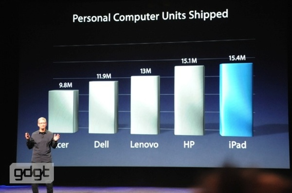
The pre-existing iPad sales were hardly anaemic.

Apple shipped more iPads than all others shipped PCs

(This was just from the last reported quarter)

The fact that an unmatched software base (over a quarter of a million apps work on iPad) and a slightly insane 25 billion downloaded apps in total on iOS makes for customers that are not likely to be going anywhere else soon, seems to be lost on these so-called experts who think that hundreds of millions of iOS customers are suddenly going to jump ship to another platform “soon”.

What impressed me the most was that Apple was able to include a much more powerful SOC, a 4G LTE radio, known to drain Android handsets in little more than an hour and 4 times the pixels (can’t wait to read Instapaper) at a far greater colour saturation level on a device that doesn’t drain the battery any faster than its predecessor. That’s an engineering rabbit-out-of-the-hat delivered with insouciance by a confident company on top of its game while it sits on top of the world. Ridiculously impressive, and ridiculed only by the self-evidently ridiculous.

For the developer of iPad apps though, there is now a serious problem that I have never faced in 30 years of software development. It’s simply this: Never before has a target device had a greater resolution than the display used to create the software for it. The worst case has been parity (like when I wrote games for the Atari 400 on the hardware itself). Up until last week, the resolution on most high definition monitors meant that what you saw on your iPhone Retina could at least fit onto your working HD display, even if the dot pitch meant you’d see a grotesquely bloated version of it, but with the new iPad, you won’t even be able to see all of the pixels.

That’s a first.

And if that doesn’t scare the competition, they are already over.

(March 17, 2012 update: Note I said “most” monitors. There are always edge cases. I specifically excluded the wonderful 27″ iMac and the Thunderbolt display, out of the reach of many people, myself included for now. In any case, neither the 27″ iMac display, nor the Thunderbolt display and other such devices can come close to the pixel density of the amazing new iPad. The display on this new device is entrancing.)